Using PPC for model evaluation#
What is PPC?#
Posterior Predictive checks (PPC) are a way to validate the goodness of fit of your generative models by computing metrics on reconstructed counts and on the raw counts and comparing the results. Samples are taken from the posterior predictive distribution: \(p(\hat{x} \mid x)\).
You can build a better intuition for it by reading more here and here.
Imports#
import scvi
import anndata
import pandas as pd
import numpy as np
import scanpy as sc
import matplotlib.pyplot as plt
from scvi_criticism import run_ppc, PPC, PPCPlot
Get the data and model#
Here we use the data and pre-trained model obtained from running this scvi-tools tutorial.
The dataset used is a subset of the heart cell atlas dataset:
Litviňuková, M., Talavera-López, C., Maatz, H., Reichart, D., Worth, C. L., Lindberg, E. L., … & Teichmann, S. A. (2020). Cells of the adult human heart. Nature, 588(7838), 466-472.
If you have not yet pre-trained the model uncomment and run the below to pre-train the model and save it locally:
# adata = scvi.data.heart_cell_atlas_subsampled()
# sc.pp.filter_genes(adata, min_counts=3)
# adata.layers["counts"] = adata.X.copy()
# sc.pp.normalize_total(adata, target_sum=1e4)
# sc.pp.log1p(adata)
# adata.raw = adata
# sc.pp.highly_variable_genes(
#     adata,
#     n_top_genes=1200,
#     subset=True,
#     layer="counts",
#     flavor="seurat_v3",
#     batch_key="cell_source"
# )
# scvi.model.SCVI.setup_anndata(
#     adata,
#     layer="counts",
#     categorical_covariate_keys=["cell_source", "donor"],
#     continuous_covariate_keys=["percent_mito", "percent_ribo"]
# )
# model = scvi.model.SCVI(adata)
# model.train()
# model.save("local/hca/")
Run this to load the model:
model_path = "local/hca"
model = scvi.model.SCVI.load(model_path)
INFO File local/hca/model.pt already downloaded
model
SCVI Model with the following params:
n_hidden: 128, n_latent: 10, n_layers: 1, dropout_rate: 0.1, dispersion: gene, gene_likelihood: zinb,
latent_distribution: normal
Training status: Trained
model.adata
AnnData object with n_obs × n_vars = 18641 × 1200
    obs: 'NRP', 'age_group', 'cell_source', 'cell_type', 'donor', 'gender', 'n_counts', 'n_genes', 'percent_mito', 'percent_ribo', 'region', 'sample', 'scrublet_score', 'source', 'type', 'version', 'cell_states', 'Used', '_scvi_batch', '_scvi_labels'
    var: 'gene_ids-Harvard-Nuclei', 'feature_types-Harvard-Nuclei', 'gene_ids-Sanger-Nuclei', 'feature_types-Sanger-Nuclei', 'gene_ids-Sanger-Cells', 'feature_types-Sanger-Cells', 'gene_ids-Sanger-CD45', 'feature_types-Sanger-CD45', 'n_counts', 'highly_variable', 'highly_variable_rank', 'means', 'variances', 'variances_norm', 'highly_variable_nbatches'
    uns: '_scvi_manager_uuid', '_scvi_uuid', 'cell_type_colors', 'hvg', 'log1p'
    obsm: '_scvi_extra_categorical_covs', '_scvi_extra_continuous_covs'
    layers: 'counts'
Overview of scvi-criticism#
There are two classes that you can use with scvi-criticism. One is the PPC class and the other is the PPCPlot class.
scvi-criticism.PPC#
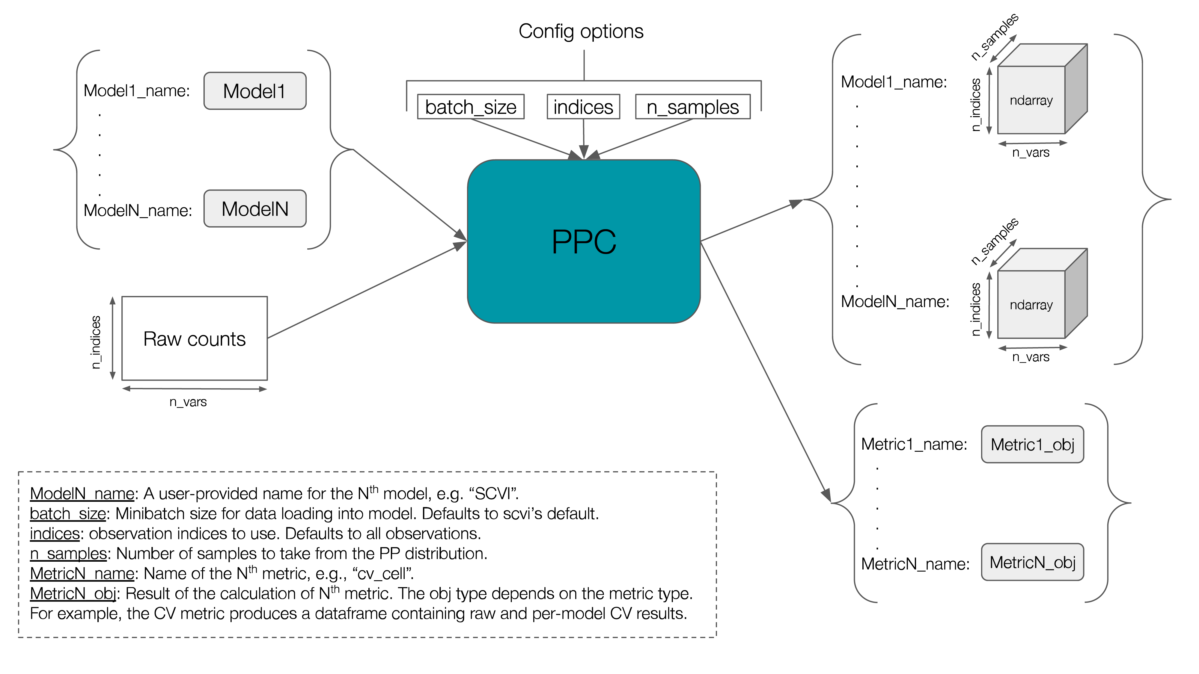
The PPC class can be used to compute posterior predictive samples and compute various metrics on them.
The figure below gives an overview of the input/outputs of this class.
Currently, three metrics are implemented:
Coefficient of variation — aka CV. This is the standard deviation divided by the mean and can be computed cell-wise or gene-wise. We support both.
Mann–Whitney U — aka MWU.
We will see each of these in more detail below where we compute and plot the output of each of them.
The scvi-criticism package also provides a convenience function called run_ppc that you can call with your favorite metric that you want to compute for a given model. It will take care of much of the boilerplate and call the right PPC methods so you don’t have to.
def run_ppc(
    adata: AnnData,
    model,
    metric: str,
    n_samples: int,
    layer: Optional[str] = None,
    custom_indices: Optional[Union[int, Sequence[int]]] = None,
    **metric_specific_kwargs,
)
scvi-criticism.PPCPlot#
As its name indicates, the scvi-criticism.PPCPlot class can be used to draw various plots displaying metrics computed by the PPC class.
The PPCPlot class takes a single required argument which is the instance of PPC that holds your computed metrics.
We’ll see concrete examples of how to use PPCPlot below where we compute different metrics on our data.
PPC + coefficient of variation#
First, let’s run PPC and use the coefficient of variation as metric.
Below is the code to do so, with step by step explanations. We’ll later see that we can skip most of this with a simple call to run_ppc.
# pick the indices you want to use. here we use all observations
indices = np.arange(model.adata.n_obs)

# get the raw (counts) data from .X or a layer if applicable
raw_data = model.adata[indices].layers["counts"]

# create PPC instance
n_samples = 5
ppc = PPC(n_samples=n_samples, raw_counts=raw_data)

# define your models dictionary. here we use only one model
model_name = f"{model.__class__.__name__}"
models_dict = {model_name: model}

# compute posterior predictive samples for your models
ppc.store_posterior_predictive_samples(models_dict, indices=indices)

# calculate the CV metric
ppc.coefficient_of_variation(cell_wise=True)
Instead of the above, you can simply call run_ppc which will do exactly the same as above.
n_samples = 5
ppc = run_ppc(model.adata, model, "cv_cell", n_samples = n_samples, layer="counts")
ppc
--- Posterior Predictive Checks ---
n_samples = 5
raw_counts shape = (18641, 1200)
models: ['SCVI']
metrics:
{
    "cv_cell": "Pandas DataFrame with shape=(18641, 2), columns=['SCVI', 'Raw']"
}
Let’s see what the cv_cell metric contains:
ppc.metrics["cv_cell"]
| SCVI | Raw | |
|---|---|---|
| 0 | 6.510572 | 9.820683 |
| 1 | 7.702765 | 8.686443 |
| 2 | 5.373195 | 4.587027 |
| 3 | 6.202974 | 6.262758 |
| 4 | 4.776725 | 5.975578 |
| ... | ... | ... |
| 18636 | 6.560287 | 8.613652 |
| 18637 | 6.063679 | 5.561197 |
| 18638 | 9.950002 | 10.452272 |
| 18639 | 6.241374 | 7.699229 |
| 18640 | 7.458881 | 7.511846 |
18641 rows × 2 columns
This is a pandas DataFrame where each row is a cell. The “Raw” column contains the cell-wise coefficient of variation computed on the raw data. The “SCVI” column contains the same computed on the posterior predictive samples (averaged over the N posterior predictive samples). If our model fits the data well, according to this metric, we’d ideally want these values to be “similar”.
Let’s evaluate this similarity by:
plotting a scatterplot that disaplys these values, and comparing it (visually) to the identity line
computing the correlation of these vectors
This is where we can use the PPCPlot class.
ppc_plt = PPCPlot(ppc)
ppc_plt.plot_cv(model_name="SCVI", cell_wise=True)
INFO     model=SCVI | metric=cv_cell | n_cells=18641:
         Mean Absolute Error=0.87,
         Mean Squared Error=1.62
         Pearson correlation=0.80
         Spearman correlation=0.82
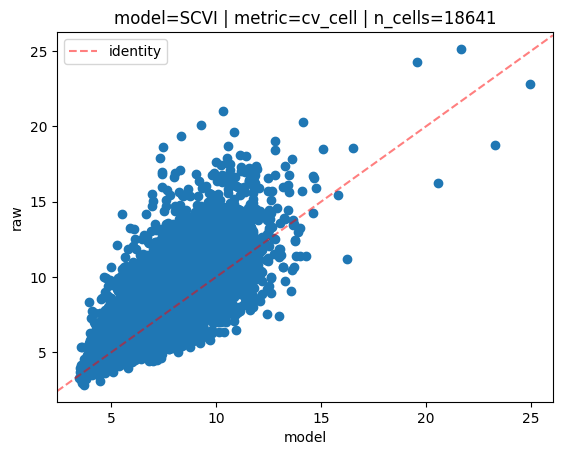
On the scatterplot above, each dot is a cell. The y axis represents the cell-wise coefficient of variation values computed for each cell on the raw data. The x axis represents the cell-wise coefficient of variation values computed for each cell on the posterior predictive samples (averaged over the N samples).
We also compute a few different correlation metrics, namely mean absolute/squared errors, and pearson/spearman correlations.
Let’s do the same but gene-wise:
ppc = run_ppc(model.adata, model, "cv_gene", n_samples = n_samples, layer="counts")
ppc
--- Posterior Predictive Checks ---
n_samples = 5
raw_counts shape = (18641, 1200)
models: ['SCVI']
metrics:
{
    "cv_gene": "Pandas DataFrame with shape=(1200, 2), columns=['SCVI', 'Raw']"
}
ppc_plt = PPCPlot(ppc)
ppc_plt.plot_cv(model_name="SCVI", cell_wise=False)
INFO     model=SCVI | metric=cv_gene | n_cells=18641:
         Mean Absolute Error=1.36,
         Mean Squared Error=14.29
         Pearson correlation=0.95
         Spearman correlation=0.99
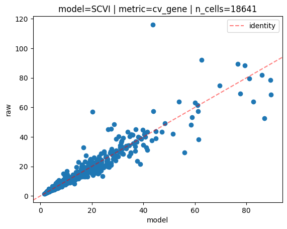
This time each dot on the scatterplot is a gene. As expected, there is fewer of them in this case.
PPC + DE#
In this section, we evaluate goodness of fit of the model by running differential expression on the raw data, then on the reconstructed counts and comparing the DE results.
Once again, we can use run_ppc to compute the metric for us in one call:
n_samples = 1
ppc = run_ppc(model.adata, model, "diff_exp", n_samples = n_samples, layer="counts", de_groupby="cell_type")
ppc
--- Posterior Predictive Checks ---
n_samples = 1
raw_counts shape = (18641, 1200)
models: ['SCVI']
metrics:
{
    "diff_exp": {
        "adata_raw": "AnnData object with n_obs=18641, n_vars=1200",
        "var_names": {
            "Adipocytes": [
                "GPAM",
                "MGST1"
            ],
            "Atrial_Cardiomyocyte": [
                "MYL7",
                "RYR2"
            ],
            "Endothelial": [
                "VWF",
                "B2M"
            ],
            "Fibroblast": [
                "DCN",
                "NEGR1"
            ],
            "Lymphoid": [
                "PTPRC",
                "B2M"
            ],
            "Mesothelial": [
                "ITLN1",
                "PLA2G2A"
            ],
            "Myeloid": [
                "CD163",
                "CTSB"
            ],
            "Neuronal": [
                "NRXN1",
                "CDH19"
            ],
            "Pericytes": [
                "RGS5",
                "PLA2G5"
            ],
            "Smooth_muscle_cells": [
                "ACTA2",
                "MYH11"
            ],
            "Ventricular_Cardiomyocyte": [
                "RYR2",
                "SORBS2"
            ]
        },
        "SCVI": {
            "adata_approx": "AnnData object with n_obs=18641, n_vars=1200",
            "lfc_df_approx": "Pandas DataFrame with shape=(11, 22), first 5 columns=['GPAM', 'MGST1', 'MYL7', 'RYR2', 'VWF']",
            "lfc_mae": "Pandas Series with n_rows=11",
            "lfc_mae_mean": 0.7108566101240225,
            "lfc_pearson": "Pandas Series with n_rows=11",
            "lfc_pearson_mean": 0.9310277325971511,
            "lfc_spearman": "Pandas Series with n_rows=11",
            "lfc_spearman_mean": 0.9382091592617907,
            "fraction_df_approx": "Pandas DataFrame with shape=(11, 22), first 5 columns=['GPAM', 'MGST1', 'MYL7', 'RYR2', 'VWF']",
            "fraction_mae": "Pandas Series with n_rows=11",
            "fraction_mae_mean": 0.02348371559580257,
            "fraction_pearson": "Pandas Series with n_rows=11",
            "fraction_pearson_mean": 0.9893390784300053,
            "fraction_spearman": "Pandas Series with n_rows=11",
            "fraction_spearman_mean": 0.9751844878784215,
            "gene_comparisons": "Pandas DataFrame with shape=(11, 3), columns=['precision', 'recall', 'f1']"
        },
        "lfc_df_raw": "Pandas DataFrame with shape=(11, 22), first 5 columns=['GPAM', 'MGST1', 'MYL7', 'RYR2', 'VWF']",
        "fraction_df_raw": "Pandas DataFrame with shape=(11, 22), first 5 columns=['GPAM', 'MGST1', 'MYL7', 'RYR2', 'VWF']"
    }
}
There is quite a lot of information in the metrics this time, so let’s take a closer look:
ppc.metrics["diff_exp"].adata_rawis simply the raw counts data.ppc.metrics["diff_exp"].var_namesis a dictionary where keys are DE groups (for example cell types), and values are arrays containing the N top differentially expressed genes in that group. The N can be specified vian_top_genesin the call torun_ppcand defaults to 2.ppc.metrics["diff_exp"].lfc_df_rawis a pandas DataFrame where rows are groups, and columns are the N top genes for all groups, i.e.,n_cols = n_top_genes_per_group * n_groups.Each DataFrame cell (group,gene) contains:
log2(mean_gene_expression_in_group / mean_gene_expression_not_in_group)for that gene, where:mean_gene_expression_in_groupis the average gene expression of that gene for all cells in that groupmean_gene_expression_not_in_groupis the average gene expression of that gene for all other cells (not in that group)
This is also called “1 vs all” logfoldchange (LFC).
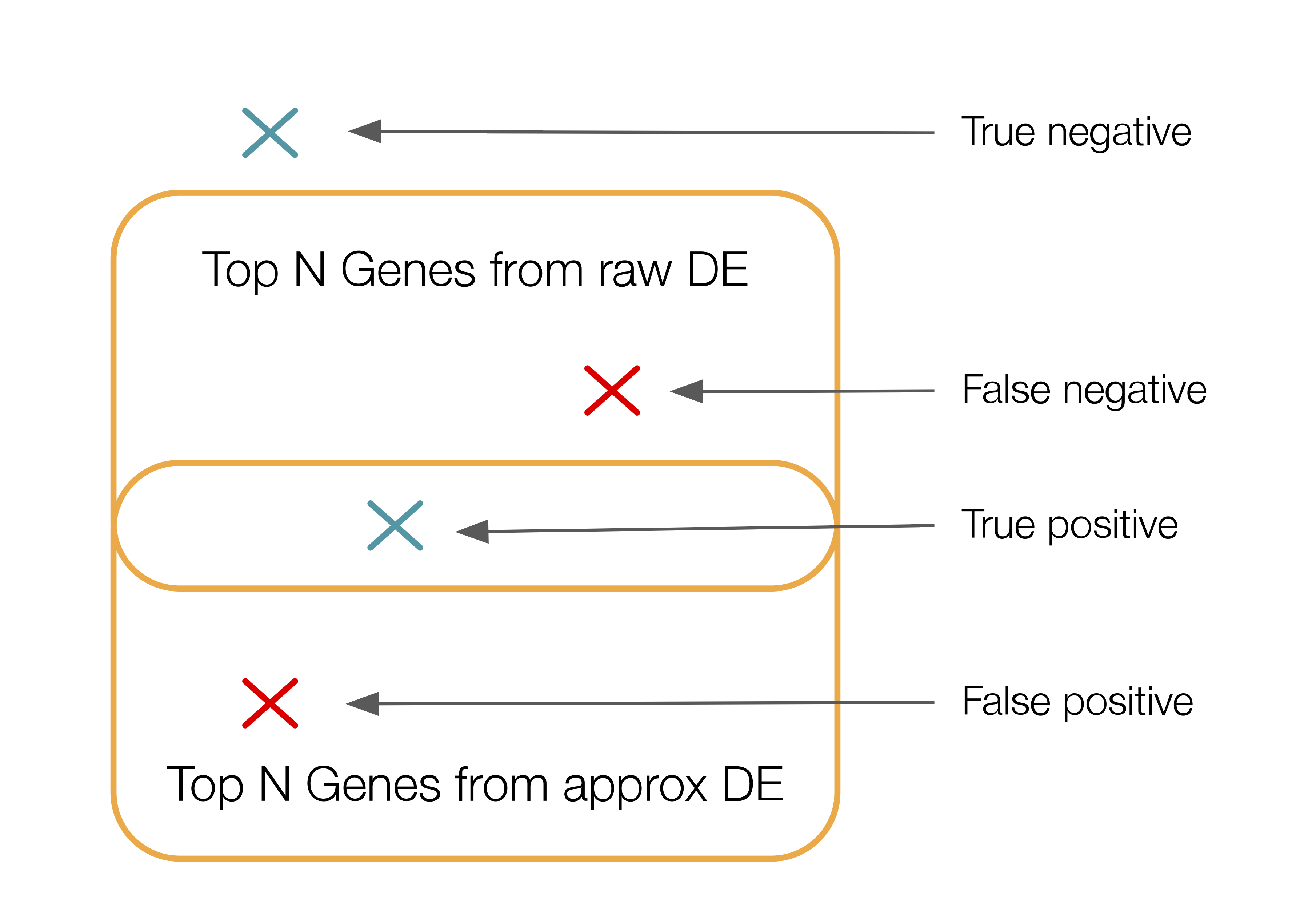
ppc.metrics["diff_exp"].fraction_df_rawis a pandas DataFrame where rows and columns are the same asppc.metrics["diff_exp"].lfc_df_raw. Each DataFrame cell (group,gene) contains the fraction of cells in that group that express that gene.ppc.metrics["diff_exp"]["SCVI"]is a dictionary that contains the outputs of computing different metrics that are specific to the model called “SCVI”.ppc.metrics["diff_exp"]["SCVI"]["adata_approx"]is the reconstructed count data.ppc.metrics["diff_exp"]["SCVI"]["lfc_adata_approx"]is the same aslfc_df_rawbut for the estimated count data.ppc.metrics["diff_exp"]["SCVI"]["lfc_mae"]is the row-wise mean absolute error betweenlfc_df_rawandlfc_adata_approx.ppc.metrics["diff_exp"]["SCVI"]["lfc_mae_mean"]is the mean oflfc_mae.ppc.metrics["diff_exp"]["SCVI"]["lfc_pearson"]is the row-wise pearson correlation betweenlfc_df_rawandlfc_adata_approx.ppc.metrics["diff_exp"]["SCVI"]["lfc_pearson_mean"]is the mean oflfc_pearson.ppc.metrics["diff_exp"]["SCVI"]["lfc_spearman"]is the row-wise spearman correlation betweenlfc_df_rawandlfc_adata_approx.ppc.metrics["diff_exp"]["SCVI"]["lfc_spearman_mean"]is the the mean oflfc_spearman.ppc.metrics["diff_exp"]["SCVI"]["fraction_df_approx"]is the same asfraction_df_rawbut for the estimated count data.ppc.metrics["diff_exp"]["SCVI"]["fraction_mae"]is the same aslfc_maebut for gene expression fractions instead of lfc.ppc.metrics["diff_exp"]["SCVI"]["fraction_mae_mean"]is the same aslfc_mae_meanbut for gene expression fractions.ppc.metrics["diff_exp"]["SCVI"]["fraction_pearson"]is the same aslfc_pearsonbut for gene expression fractions.ppc.metrics["diff_exp"]["SCVI"]["fraction_pearson_mean"]is the same aslfc_pearson_meanbut for gene expression fractions.ppc.metrics["diff_exp"]["SCVI"]["fraction_spearman"]is the same aslfc_spearmanbut for gene expression fractions.ppc.metrics["diff_exp"]["SCVI"]["fraction_spearman_mean"]is the same aslfc_spearman_meanbut for gene expression fractions.ppc.metrics["diff_exp"]["SCVI"]["gene_comparisons"]is a pandas DataFrame where rows are groups. Each row reports a precision, recall and F1 score that represents the overlap between the top N differentially expressed genes in that group on the raw data and the top N differentially expressed genes in that group on the estimated count data. The N can be specified vian_top_genes_overlapin the call torun_ppcand defaults to:min(adata_raw.n_vars, DEFAULT_DE_N_TOP_GENES_OVERLAP).This is how this overlap is calculated: for each group, we consider the unordered set of top ranked genes between raw and approx DE results. To do that we “binarize” the gene selections: we create two binary vectors (one for raw, one for approx) where a 1 in the vector means gene was selected. We then compute the precision, recall and F1 score between these two vectors. Below is a depiction of those notions in this context:
That’s a lot of text. Let’s visualize some of these metrics.
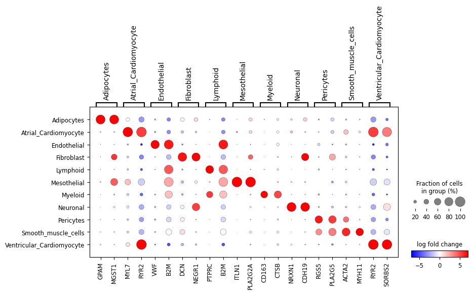
First, let’s look at the “1 vs all” LFC dotplot for the raw and approximated count data:
ppc_plt = PPCPlot(ppc)
ppc_plt.plot_diff_exp("SCVI")
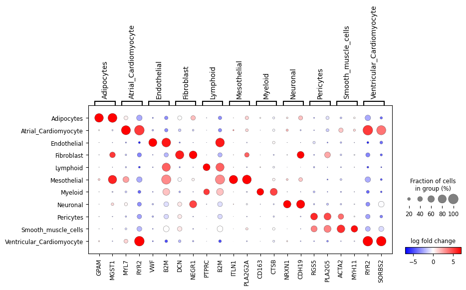
We can also look at a subset of the genes:
ppc_plt.plot_diff_exp("SCVI", var_names_subset=["Ventricular_Cardiomyocyte"])

These all look very similar but it’s hard to evaluate that visually. Let’s look at the mean absolute error (MAE), pearson and spearman correlations between the two:
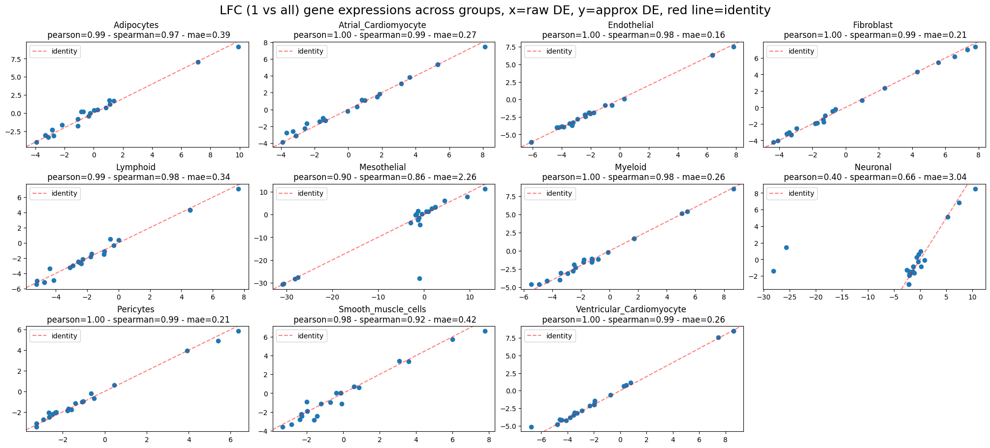
ppc_plt.plot_diff_exp("SCVI", plot_kind="lfc_comparisons")
INFO     LFC (1 vs all) gene expressions across groups:
         Mean Absolute Error=0.71,
         Pearson correlation=0.93
         Spearman correlation=0.94
ppc_plt.plot_diff_exp("SCVI", plot_kind="fraction_comparisons")
INFO     fractions of genes expressed per group across groups:
         Mean Absolute Error=0.02,
         Pearson correlation=0.99
         Spearman correlation=0.98
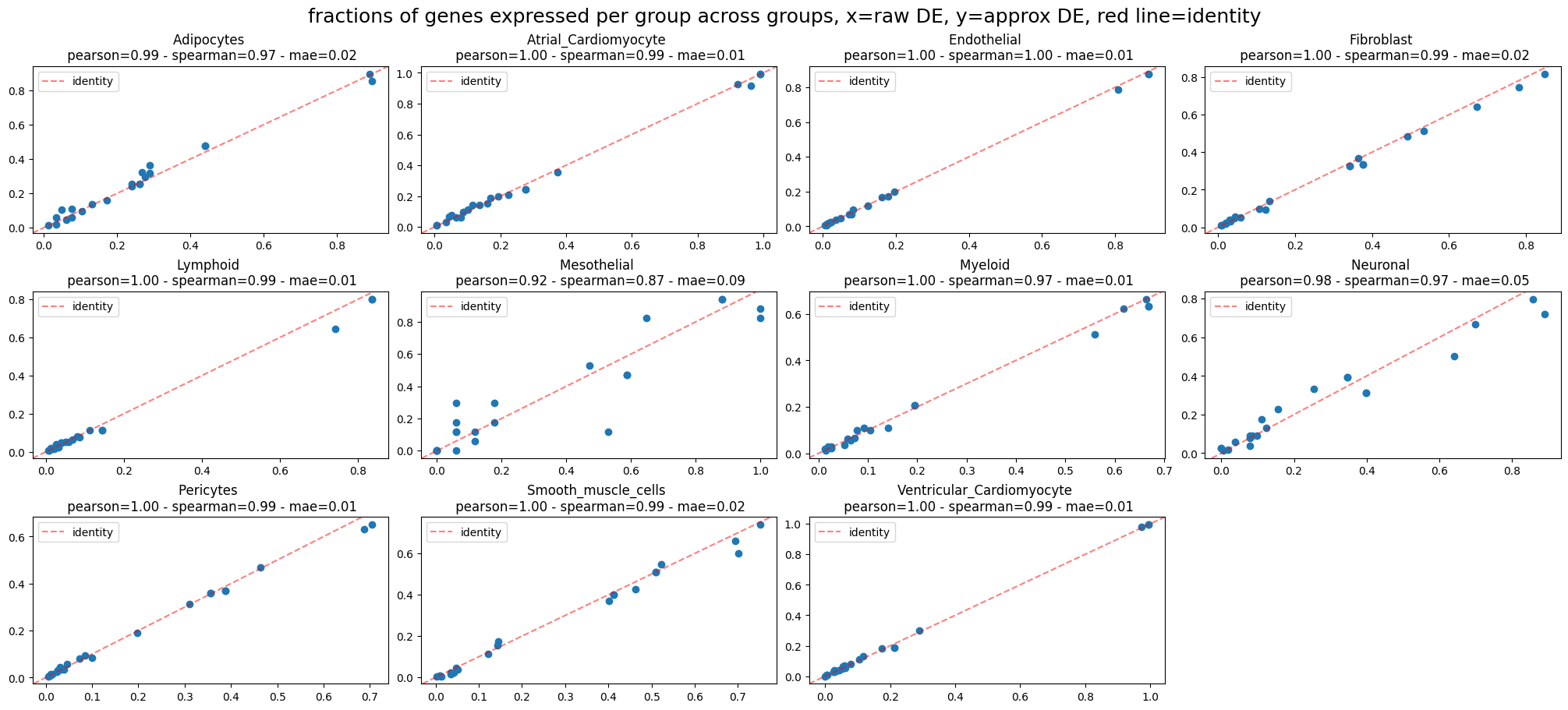
That looks pretty good.
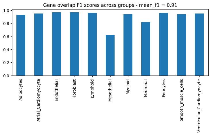
Next, let’s look at the F1 score for the top N genes that are differentially expressed in each group:
ppc_plt.plot_diff_exp("SCVI", plot_kind="gene_overlaps")
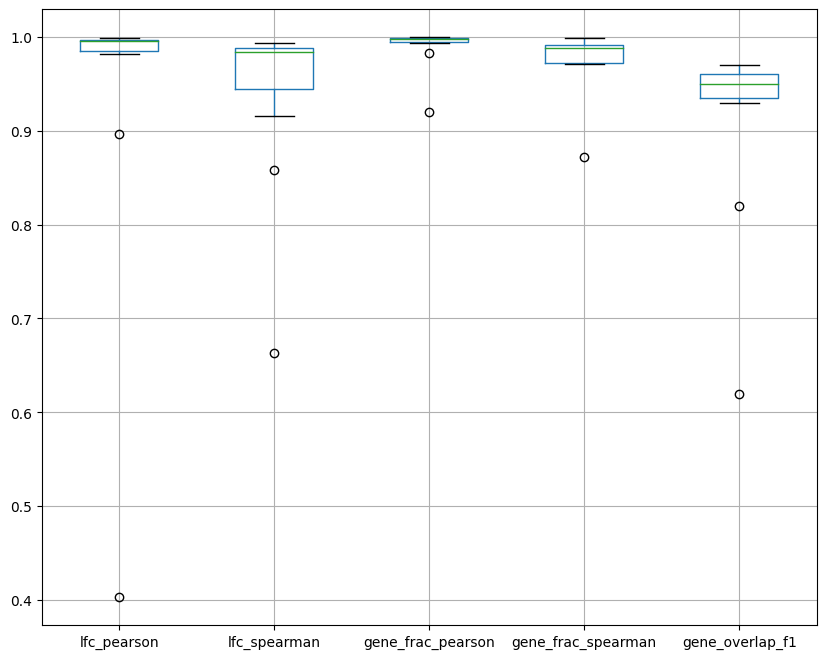
Last but not least, let’s plot a summary. In the box plot below, dots are groups and the x axis represents the various metrics we computed and plotted separately earlier. The box plot shows the distribution of the metrics across groups.
ppc_plt.plot_diff_exp("SCVI", plot_kind="summary")